Tuesday 11 December 2012

Christmas Competition


I created this design for a Christmas competition, 'Coming together at Christmas'.

There were no particular guidelines, just to create a design relating to the seasonal holiday, so I created this. One of my favourite images of Christmas is a robin sat on top of a snowy postbox, and this is the result.

I have used textures for the postbox and the robin, to give a modern feel. I used Photoshop to create the image.

Size = 500 pixels wide x 700 pixels high.

Thursday 29 November 2012

A1 Moodboard


My A1 moodboard to accompany my written proposal for the Final Major Project. I've chosen to do it on J.D. Salinger's 'Catcher in the Rye' because I wanted to read it again, and also because there weren't many other things I wanted to give a shot at as much as this. 

It is essentially a collaboration of previously illustrated book covers and illustrations, mixed with my own drawings of important parts of the text. There aren't many illustrations (next to none) for the text, so I want to create illustrations for the narrative, a book jacket and continue editorial work (in the form of book reviews etc.) and this is the starting point. 

To create the collage I used found pictures, inks, various paints, colouring pencils, pastel pencils and spray paints.

Tuesday 27 November 2012

Picture Book Project


My two double page spread ideas for the picture book project. The story is about a woman who wants to eat a child, but since no parent wants to give up their child in the village, she ventures home and eats her own child without realising who he was. 

I used gouache paints, coloured inks and edited the result on Photoshop. 

Influences include Lane Smith.

Approx. 30 x 11cm

Thursday 8 November 2012

Green Day Design


My design for a Green Day competition. It is for the bands Facebook timeline photo, and Green Day have always been one of my favourite bands so I had to enter. I used parts of all their albums (13 in total) to create a collage using Photoshop.

Voting is open now until 13th November so please vote for me. Follow the link --

Thanks!

Size = 851 x 315 pixels.

Monday 5 November 2012

How To Write A Book In 30 Days.


My artwork for a magazine supplement cover advertising people who like to read to encounter writing their own book. 

Firstly, I created a gouache painting of a basic owl shape, which I scanned in and edited using Photoshop. I included typewriter wheels for the owl's eyes, pen nibs and quills for the wing feathers and different forms of text such as typewriter keys and scrabble letters.

In my tutorial, the feedback I received for this work was really good, and the editorials have definitely been beneficial for me.

Size = A4

Wednesday 31 October 2012

Advertisement for 'Giant Pocky'


My idea for the advertisement for giant Pocky. I've painted each element with gouache and put it together using Photoshop. I played around with this a lot to find the right saturation and overall look of the advert. It has helped me gain confidence using materials I haven't used very often so far, that I feel I can use from now on successfully.

Appropriate for Halloween, too!

Size = 200 x 290 mm

Monday 29 October 2012

'Madness of Crowds'


My idea for the article 'Madness of Crowds', explaining how because of the recession, Las Vegas is becoming a holiday resort to make money, meaning more children are going there while adults gamble.

I used gouache for the Vegas skyline, and collaged everything together using Photoshop and put it all on a graph to show the decline of Vegas. In feedback, it was mentioned I could make the skyline more like a graph showing a sharper decline than it has here, definitely something I could change.

Size of Illustration = 115 x 105 mm

Thursday 25 October 2012

Mail Art Lincoln


I put this postcard together in a short space of time because I wanted to mail my artwork for the 'Mail Art' exhibition happening in Lincoln now on Sincil Street. I flicked through a small book I have which is based on postcard artwork and made this. It's basically a wheel with the zodiac signs on it, with a bit of collage added to it. I used gouache, gold paint and inks on brown parcel paper. I used an actual postcard and painted over it so that it would be sturdy enough to withstand going through the post.

I have heard that the postcard was put up in the exhibition with my name next to it too!

Wednesday 24 October 2012

Tremors Blog


I was asked to create a logo for a new website created by students studying Journalism. The website has been made to inform people about live music happening in Lincoln. It needed to be appropriate to this theme and with the title 'Tremors' and this is what I came up with. I created it using Photoshop.

You can see the logo on the website: http://tremors.blogs.lincoln.ac.uk/ 

Monday 22 October 2012

'Sun, Sea, Sand... and Sniffles'


My illustration incorporated into the article we were given, this time about getting ill on the first day of your holiday due to working hard and finding it hard to relax.
I painted the background using gouache and then played around with it on Photoshop. The foot is taken from a photograph and again changed on the computer. I added bacteria to the swimming pool and replaced the sun for a yellow paracetamol. 

I tried to crop the image down a bit further but then it lost detail which I wanted to keep. I haven't worked in this style before so I'm quite pleased with my progress there! After tutorial it was apparent that the germs in the water need to be bigger, especially in the printed version they merged with the water too much.

Size = 120 x 120 mm

Tuesday 16 October 2012

'Why Small Victories Matter.'


My idea for this article, which is about overcoming big challenges by completing small tasks can be most rewarding. 

I chose to take the 'v for victory' sign and put the hands together to create a star, because stars are a symbol  and given for achievement. The background was painted using gouache and a photograph of the hands were rotated and changed using photoshop. I'm very pleased with the result, particularly since I've not used photoshop much.

Size = 100 x 95 mm

Thursday 11 October 2012

A Social Gathering...


My collage for the brief entitled 'A Social Gathering', combining all our characters from the summer project into one piece of artwork. 

I chose to do a roller-coaster out of a few ideas (including a street corner and a kitchen), because I could distort it to look disproportionate and less like an average scene. Creating it in collage also contributed to this.

The majority of the characters I created are not people that you would expect to see on a roller-coaster, and I found it very difficult to make them relate to each other. The psychiatrist and old man are looking to our left   at the soldier, who in turn is looking at the scientist. This is the main correspondence between them. I didn't change the poses much at all, they all look in different directions etc. The rabbit was the odd one out, so I made it the girl's toy that she is clinging onto.
The map in the background is not significant, although it makes it impossible to know exactly where the characters are. 

Inspired by Gary Panter and David Hockney

Size: 250 x 360 mm

Wednesday 10 October 2012

'How To... Decorate'


My artwork created for an article about people 'decorating' themselves. The text began talking about military decoration and referred to the peacock several times, so I combined the two ideas in this editorial illustration.

I used gouache for this (with ink for detail afterwards), which I feel overpowers the medals which have been collaged over the top. Perhaps I should have used watercolours to make the medals the dominant decoration in the image. Despite this, I was pleased with the way the paints merged in parts of the image, particularly the 'eyes' on the peacock's feathers.

Wednesday 3 October 2012

'Self-Portrait'


For the next part of the project (following on from the Characters project) a self portrait was necessary to include into one piece of artwork involving all of the characters designed over summer.

This is my 'self-portrait', a collage on acetate made up from fashion magazines and a photograph of my face. Because I made it on acetate, it looks very lifelike and almost like a photograph, so hopefully this will contribute to the surrealism of the final image, as this will be the only realistic character, the rest being unrealistic and animated.

Saturday 15 September 2012

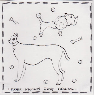
Character Doodle


Sat doodling a couple of days before I go back for my third year and I came up with this.

I'm going to add it to my character work for the summer project, even though it's the only animal character I'll have produced.


Wednesday 5 September 2012

More Collage...


Experimenting with more collage using PostScript magazines and fashion catalogues (which I chose to use for their shiny appearance).

The subject is an orange lifebuoy, the idea wasn't planned much, when I started tearing orange pieces of paper I decided on it. Also, I'm quite fond of nautical things.

Size = 5cm x 13cm.

Wednesday 29 August 2012

Collage


A self directed collage inspired by Derek Gores.

I watched a few videos on YouTube of Derek Gores' work and wanted to create a monochrome image of a pair of headphones. His work is quite complex, however, he creates smaller, simpler images like a pair of high heels.

This was made up of fashion magazines mainly. For example, the part that would rest on top of your head is made up of shoes etc. The cushions for the ears are made from a black leather bodywarmer in a H&M magazine. 

Size = 15 x 21cm.

Sunday 19 August 2012

Summer Project: Part Two

Part Two of the summer project was an editorial task. 

We were asked to read four different texts, articles that would be found in a newspaper like the Independent. They were to be a rough idea of what it would look like, in a client visual format.

The size of each was 102mm x 104mm


Text One:
An article about how the majority of people are dishonest when it comes to handing in lost items. Statistics showed that people were nosey as opposed to being honest and acting in a Christian way. 

The crossed fingers represent telling lies and the open padlock suggests that what they are saying is not secure, you can't trust them.


Text Two:
Text two was a piece of text based on Richard Branson stating that in order to be successful you must tolerate failure. 

I chose the greek symbol for failure, Icarus, who flew too closely to the sun with wings made of feathers and wax.


Text Three:
This article went on to talk about getting older and how you see yourself mentally being younger than you are, and having a fear of death. It mentions a book in the article, which is about overcoming that fear.

A symbol for overcoming things is hurdles, so I have replaced hurdles with coffins, representing them overcoming the fear of death.


Text Four:
The final text was about 'Schadenfreude'; finding pleasure from other's misfortunes, and enjoying irritating someone who has a different opinion to your own.

The sun is happy because the cloud is sad and raining!

Wednesday 15 August 2012

Summer Project: Part One

The first part of the summer project required us to create at least seven characters that we had designed and created. There were no specific targets, so the characters could be absolutely anything. 

I chose to stick to people because I have always found them challenging. I used mediums and materials I am not as familiar with (as this project gave an opportunity to do so) to look into different techniques and improvise with them. The characters were to be in an appropriate pose.

All are around A4 size because this was the approximate size guide we were given.

All had to be influenced by an artist, so some of my characters have been heavily influenced and others only slightly. 

Below are the characters in the order I created them:


One. Punk.

This was created using Photo Impact (very similar to Photoshop), as I have never really used the computer for creating illustrations, I decided I would try out the software to broaden my ability on it. I enjoyed experimenting and creating this image, perhaps because it is based on something I am interested in. I chose to pick out the main lines by using the 'Contour Drawing' option and changing colours and levels from there.

Artist Influences: Jean Michel Basquiat.


Two. Baby.

I have never attempted to draw a baby before and I imagined them to be quite awkward to draw. Over the summer I obtained a pyrography kit, so I found a piece of plywood around A4 in size and using pencil I created an outline to go by. The kit included different parts that could be attached to the pyrography set in order to create thicker lines or patterns. 

As you can see the lines are quite fragmented because it is difficult to produce an even line as the metal burns the wood as it heats up. I am pleased with the outcome however, and will use this technique in the future. 

Artist Influences: Keith Haring and Otto Seibold.


Three. Old Man.

This was a character I produced as I went along. I just began sketching different types of people and this was one of them. I was thinking about what the posture of an old man could be like and this was the result. 

The colours are very faded and pastel like opposed to fully saturated (colours influenced by Quentin Blake), which symbolises the physical effects of ageing. I used watered down coloured inks (including blue, sepia, green, gold and red). Pencil lines are the only outline. 

Artist Influences: Piero Piluso and Quentin Blake.


Four. Scientist.

This began as a tiny sketch on a piece of yellow paper using a biro pen. I realised my sketches were becoming better than my final images and I wanted to keep the same quality in the final product.

I scanned it into my computer and changed it on Photo Impact and this was the result. Again, I used the contour line option, with a much thinner line to represent the precision of scientists and their work. Some lines are more prominent than others and they are mainly dark grey in colour, which suits the yellow background colour, which I decided to maintain. 

Artist Influences: Phil Wrigglesworth.


Five. Psychiatrist.

This character was inspired by Saul Steinberg's 'Techniques At A Party' (the inspiration for the project itself) as there was a man sat cross-legged in an armchair and I thought it suited what a psychiatrist's pose could be.

I decided to create a collage because this was an area I stepped into during my second year and I felt confident with it and wanted to go further with it. I chose articles from a PostScript magazine and in selected newspapers that were appropriate (images too such as mazes that could symbolise the brain). 

The character himself looks quite strange and perhaps not someone you would want to talk to or confide in. He also possesses an uninviting grin.

Artist Influences: Jim Flora.


Six. Girl.

Again, a character created from random sketches, this time looking more closely at the artist Gary Baseman. 

This was experimenting with collage but using coloured materials this time without text. This has created more space in the image. The sketch I drew at first looks better than this image, so I feel it might look better in black and white. 

I looked closely at how Baseman draws faces, eyes and the background. He spends a lot of time creating a setting for his characters, which I haven't looked at much before now. 

Artist Influences: Gary Baseman.


Seven. Soldier.

Another collage, again showing text.

This was not heavily influenced by an artist, only influenced by the character himself. The text displays reports and articles about the Second World War. This was very much my own design as originally I was going to follow closely to Otto Dix's work and also produce the work in monochrome. However, as I began planning the character this was more what I had in mind. 

Artist Influences: Otto Dix (Soldier and WW2 theme only)

Saturday 21 July 2012

A Coalition of Cheetahs


Here is my artwork for 'A coalition of cheetahs'.

As an illustration group at university, the task of creating and possibly publishing a book as a class was brought up to be produced over summer. The decided theme was collective nouns. 

I chose this one because I knew it would be a challenge (and at the time had been fond of cheetahs so I wanted to go with it regardless of the group name).

I wanted to explore into typography and collage further before my final year at university, as collage is something I want to develop and the text seemed appropriate. The cheetah print was taken from a photocopy of a pair of creepers (shoes) I own that appropriately had the correct print on the top. The newspaper/collaged cheetah shape is made up of articles concerning the animals behaviour.

Medium: Mount board, coloured inks (sepia and gold), newspaper, card.

Size = approx. 40 x 30 cm.


Tuesday 17 July 2012

Keyrings


This summer I've started making my own keyrings, which I'm selling for 50p.

 Please get in touch with me on my Facebook (or Twitter) page if you would like to buy one.

The main theme so far is nature and wildlife, but I will take commissions! (can be in watercolours if requested).


A few Pet Problems...


Here are 4 images from a total of 28 'pet problems', the last second year project we were given.

I found this project took a fair while to complete as there were so many to illustrate, and as they are all based around animals I found it difficult. Despite this I enjoyed thinking of ideas and drawing them out. I would have liked to spend much more time on them, we were given 3 to 4 weeks to produce them and as it was around the time we were putting our portfolios together at the end of the year, I had other projects to complete and touch up.

These were drawn using dip pens with black ink on cartridge paper.

Size for each = 14 x 14 mm.


Monday 16 July 2012

Illustrated pages of 'The Strange Feathery Beast'


Another second year project, we were asked to illustrate a story for children (The Strange Feathery Beast) for between the ages of 9 to 11 years. The requirements were to fill in the space between the text with an image and it was to be executed in black and white. 

I used dip pens with black Indian ink and for the darker areas I used a small brush.

This was a project I really enjoyed and I began this task after I had just changed course (from Fine Art and Illustration to Illustration alone). I found it very challenging, and after changing my characters and ideas many times, this was the end product. 

Prior to this project I had found it difficult to create my own characters from scratch which I feel much more confident about now. This assignment allowed me to progress in areas I felt uncomfortable with, particularly in my first year at university.


Sunday 15 July 2012

'If we could see secrets...'


This is my collage I created for the project 'If we could see secrets...' I produced this in early April of this year for a university project. I feel it is one of my strongest pieces of work I have created throughout my second year and will certainly be looking to produce more collage work.

We were given two words in the project, an occupation and a noun. I was given the following:
LINGUIST/POLLUTION

We had to show this in an illustration, so I chose the materials so that they resemble important factors. For example, I used newspaper because they expose secrets. The articles I used were about the environment, particularly oil spills as they were topical at the time. The black areas were executed with spray paint, for this a stencil was used, this representing the pollution, as spray paint is seen as vandalism and a pollutant itself. 

Influences included Derek Gores and Michelle Caplan.

Size = 270 x 210mm.


Saturday 14 July 2012

First Post

I am beginning this blog after recently finishing my second year at the University of Lincoln studying Illustration.

I was studying both Fine Art and Illustration until around January/February time of this year.

For my dissertation in my third year I will be studying the illustrator Ralph Steadman in depth, a person I have often referred to in my artwork and who influenced my college work greatly. I will be looking at his illustration for Lewis Carroll's 'Alice's Adventures in Wonderland' in particular (again in college I transcribed some of his illustrations and found his quality of line and mark making intriguing).

Pen and ink is a medium I have felt comfortable working with for many years now. Lately I am trying to work with coloured inks and collage. Collage is also a branch of artwork I have enjoyed working with the past year.

So this blog will be an ongoing journal of my progress, work I'm creating and any ideas I have.


Watch this space.